ÉCLAT NOIR — Building a contemporary sensory signature
A complete brand identity designed to turn home fragrance into an object of presence and design.
- Client
- Concept interne CRELIVO — maison fictive
- Industry
- Art de vivre · Maison · Parfumerie · Luxe contemporain
- Year
- 2026
The challenge
ÉCLAT NOIR is a fictional home-fragrance house, created by CRELIVO to demonstrate its branding method. No client, retailer, product for sale or result is real. The problem: create a premium brand able to stand out in a fragrance market that is often overloaded or conventional (gilding, flowers, generic “spa” codes, borrowings from existing luxury houses).
The approach
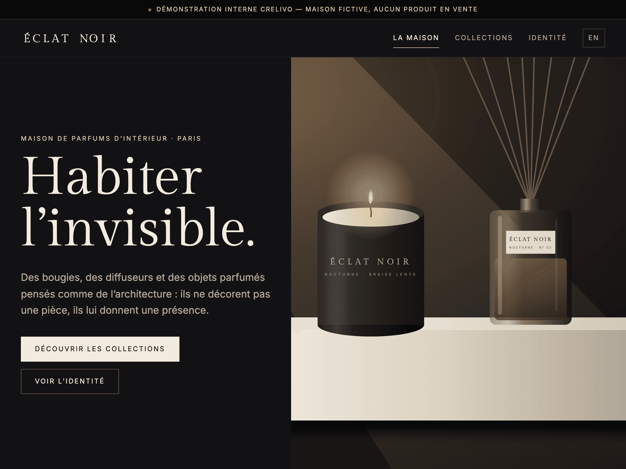
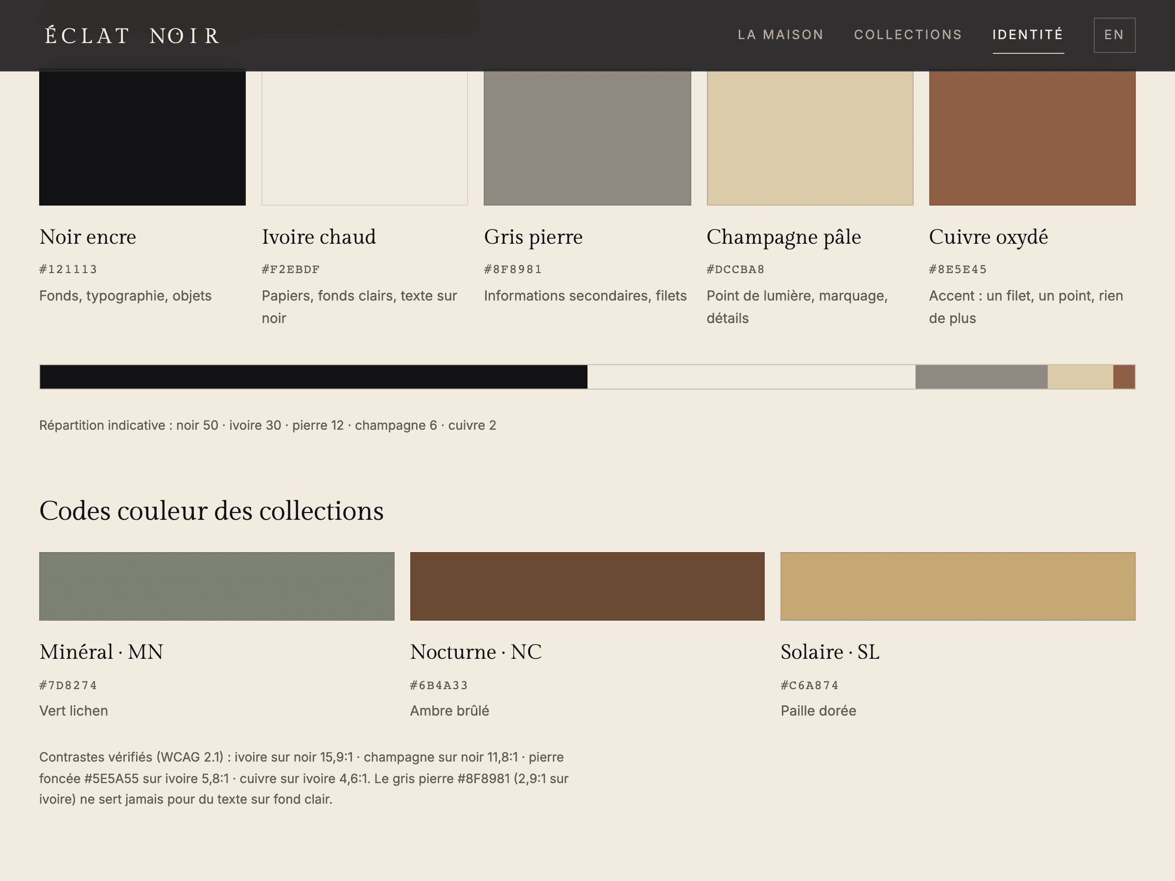
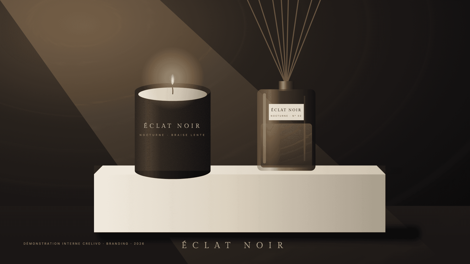
A restrained, sculptural brand system combining strategy, visual identity, packaging and digital experience. Platform: vision “make home fragrance an architectural gesture”, mission “create olfactory objects that give every space a singular presence”, signature “Habiter l’invisible.” (Inhabit the invisible.), values intent, material, silence, precision, warmth. A minimal, evocative, self-assured tone — never pretentious. Art direction: ink black, warm ivory, stone grey, pale champagne and a touch of oxidised copper. An editorial serif for the name and headings, a precise sans-serif for information. Sculptural objects, strong shadows, smoked glass, stone, wax and textured paper under warm, directional light.
The solution
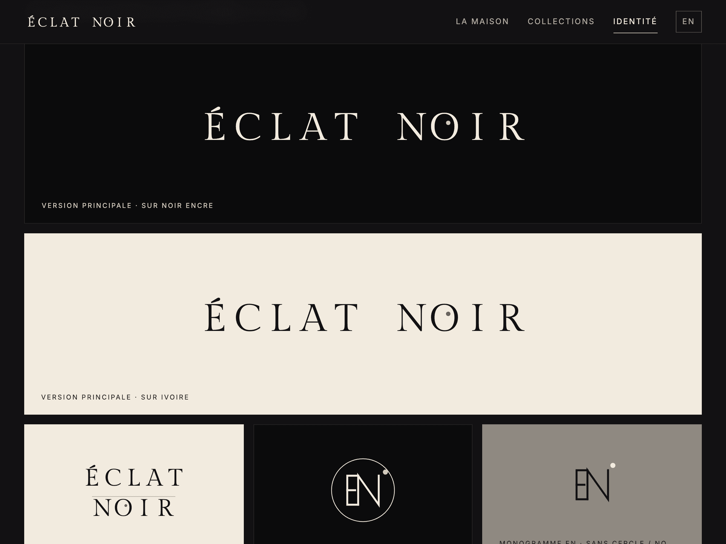
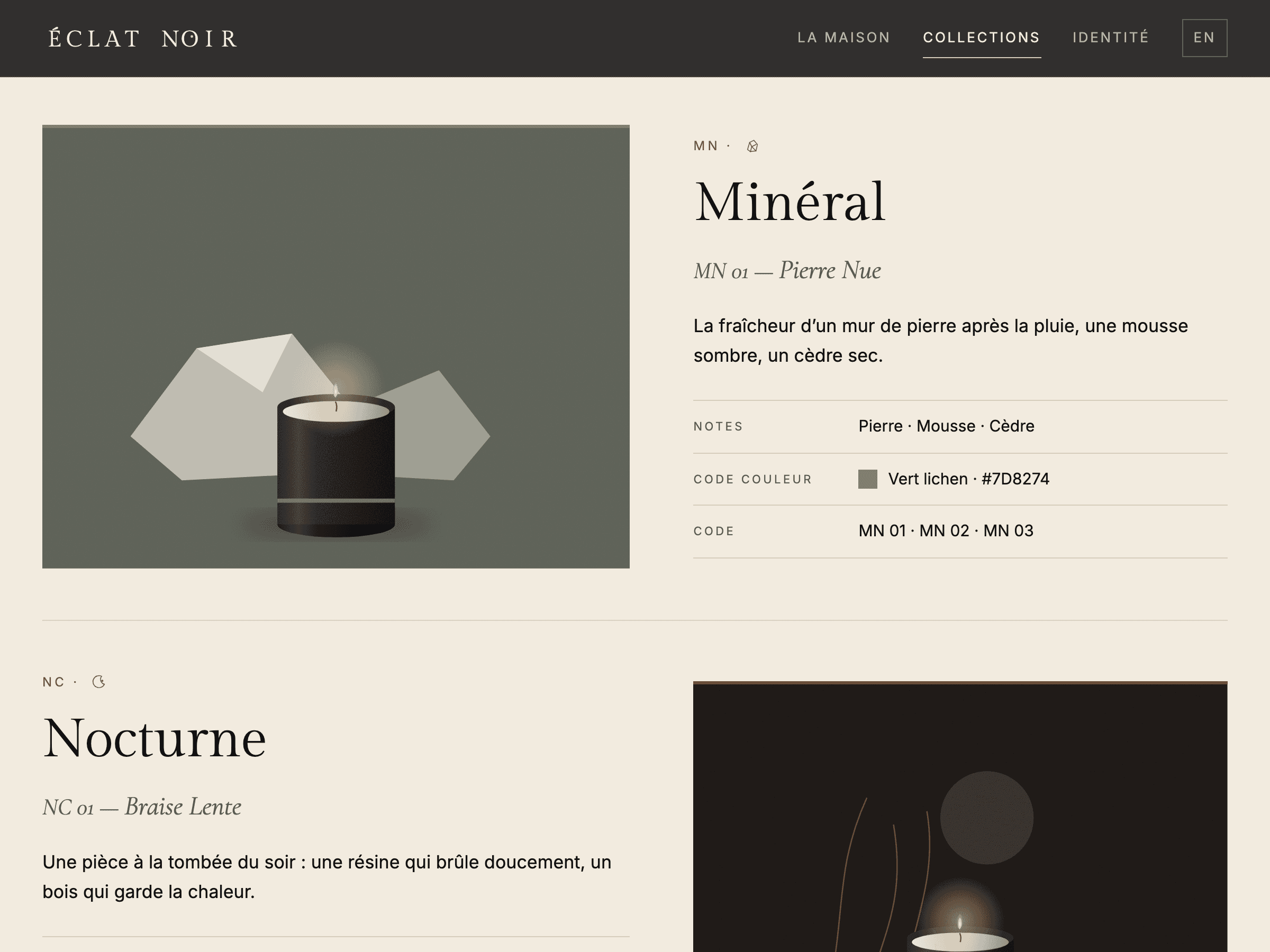
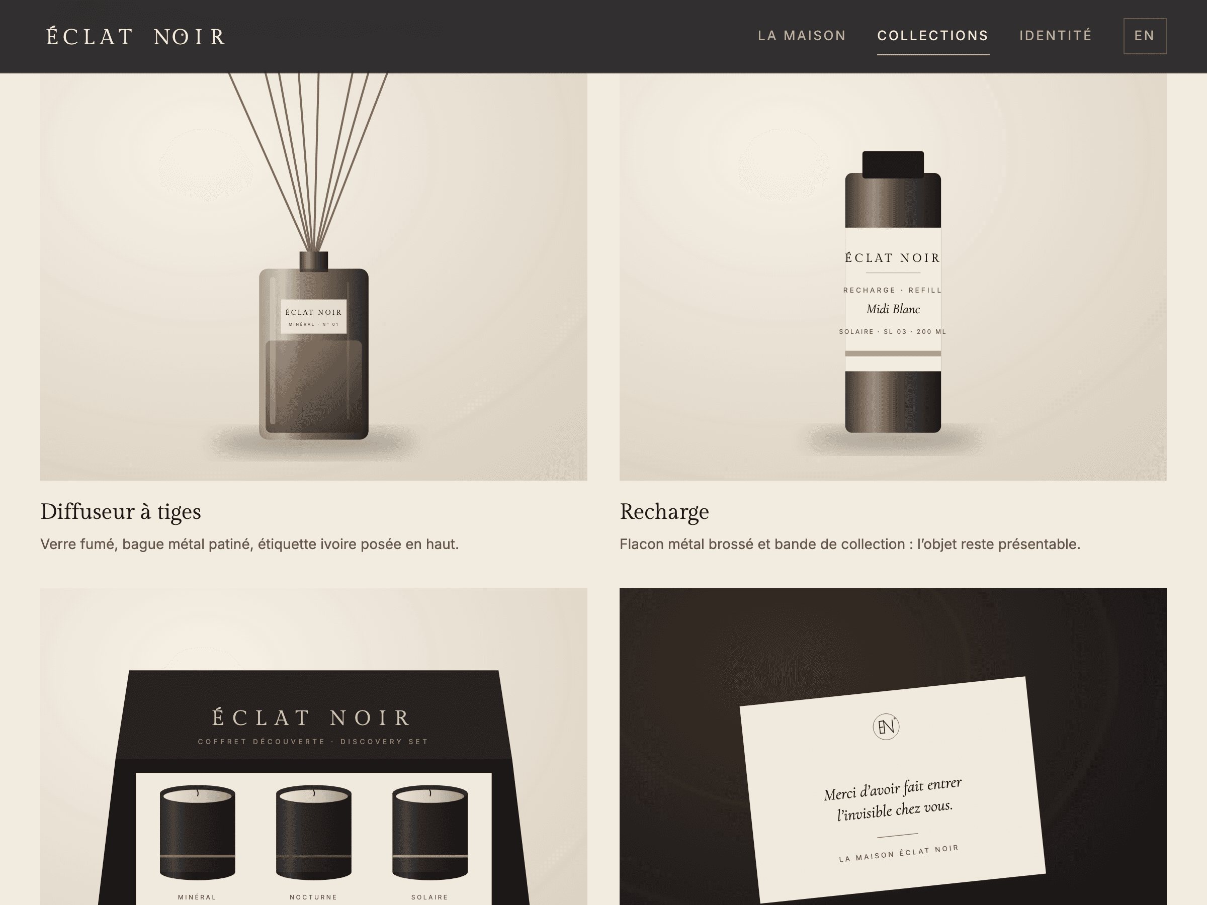
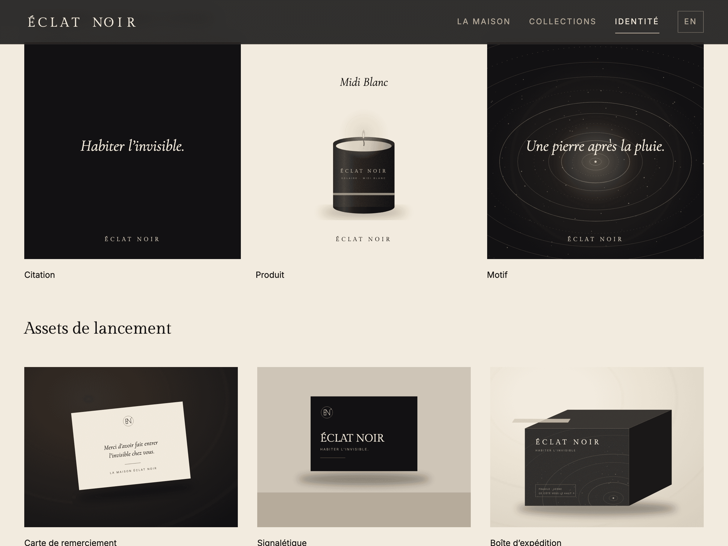
— Brand platform, naming and signature. — Original logotype on a fixed spacing grid, with a point of light inside the O; compact version and EN monogram; grid, clear space and minimum sizes. — Palette with hex codes and checked contrasts, typography rules, line iconography and signage. — “Diffusion” pattern: rings of light moving away from an off-centre point. — Three fictional collections with colour codes and consistent naming: Mineral (stone, moss, cedar), Nocturne (amber, incense, smoked wood), Solar (bergamot, fig, white tea). — Packaging: candle, reed diffuser, refill, discovery set, thank-you card, product label, shipping box. — Brand guidelines: essence, logo, colours, typefaces, iconography, photo style, pattern, do’s and don’ts, applications. — Bilingual FR/EN premium landing page: hero, the house, collections, immersive view, materials and making, journal, “Discover the collections” CTA. — Social media templates and launch assets. Original vector visuals, no stock imagery or existing brands.
The results
Qualitative outcomes (demonstration, no measured data): — A more distinctive identity. — A consistent visual system across every touchpoint. — Packaging designed to create a memorable experience. — A clear brand direction for future collections. — A digital foundation ready to present the house’s world. Deliverables: brand platform, naming, signature, logo, monogram, palette, typefaces, photographic world, packaging, guidelines, premium landing page, social media templates, launch assets.